
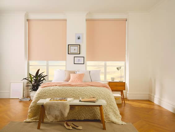

A joyous, uplifting shade, even the name is playful… Pantone’s Peach Fuzz is sure to be a big hit in the world of interiors.
Cited by the Pantone Colour Institute as ‘a velvety gentle peach tone whose all-embracing spirit enriches mind, body, and soul,’ this pastel hue is described as ‘a colour radiant with warmth and modern elegance’.
“One thing I love about Peach Fuzz is that, although it’s a calming and connecting shade, it also plays perfectly into having fun with your interiors,” says Lucy Mather, design expert from home furnishings retailer Arighi Bianchi.
It also harks back to the nostalgic vibe associated with retro pastel colours, suggests Mather, which has made a significant comeback in interior design: “Remember the retro peach bathroom suite anyone? And Peach Fuzz beautifully embodies this trend.”
Daniel Prendergast, managing director at The Rug Seller, is also a fan. “Peach Fuzz boasts incredible versatility. Its adaptability allows seamless integration into many current design schemes and trends, eliminating the necessity for a full-scale redesign.”
For example, bold florals which layer shades of peach against a deeper colour palette makes a real statement in a hallway or living area, says Prendergast.
“This gives the biophilic trend (which is still predicted to be huge for 2024) a modern update, and uses peach in a way that showcases its versatility.
Furthermore, because this pretty pastel is far more subtle than previous contenders, such as 2022’s Very Peri (a periwinkle blue), you’ll find it’s much easier to work into your current scheme – and the possibilities are endless.
“Thankfully, Peach Fuzz isn’t too alternative,” says Matt Thomas, design director, Apollo Blinds. “It looks fabulous in kitchens, and we predict it will be introduced as a soothing accent in bedrooms.
“For me this is the perfect colour to give an instant update to a kitchen, working alongside door cabinets in white or wood finishes,” suggests Thomas. “It will also complement forest green and blue finishes that have been emerging in the past couple of years as the hero colour for the kitchen.
![And for an added bonus: “Mid-century style furniture pairs really well with the colour,” highlights Thomas. “Add texture, such as boucle [or velvet] to keep it contemporary.”](https://www.connachttribune.ie/jpim-static/image/2026/04/23/07/iconic-upload-pa-2024_01_11-1704958501607_8.jpg?crop=4:3&trim=&width=800)
1.
And for an added bonus: “Mid-century style furniture pairs really well with the colour,” highlights Thomas. “Add texture, such as boucle [or velvet] to keep it contemporary.”